Complex, but never intimidating
Preserve full asset control, on-chain information and advanced capabilities while reducing cognitive load, so new users can complete key journeys with confidence and the product can grow quickly.
Best Wallet
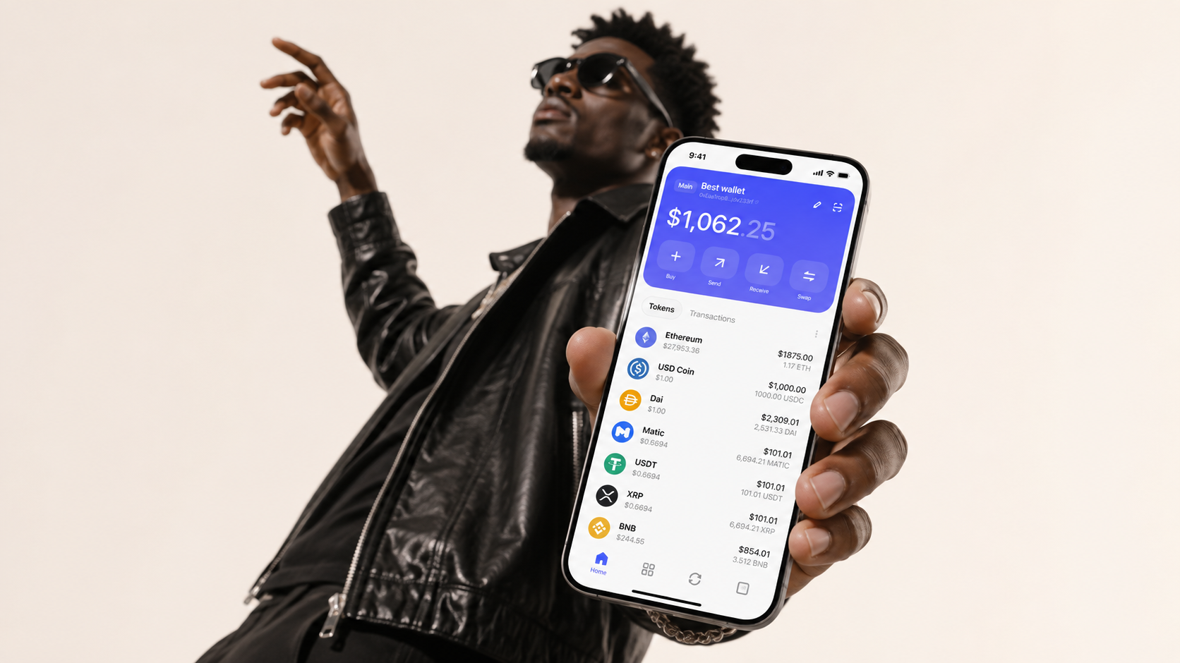
Crypto wallets often force a choice between security and ease of use: powerful enough for experts, yet unfamiliar to newcomers. Best Wallet set out to remove that trade-off.
As Founder Designer, I started with the brand identity and carried it through the mobile wallet and Web3 payment flows, giving every touchpoint the same sense of clarity and confidence.
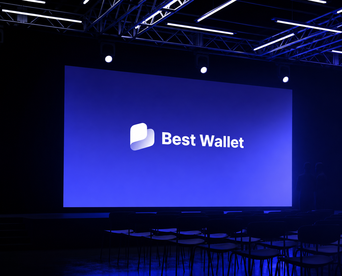
Most Web3 products signal expertise with more terminology. Best Wallet took the opposite approach: make risk visible without allowing complexity to become a barrier. The brand's central role was to make control clear, understandable and actionable.
When the brand entered the product, the challenge was not simply to make the interface easier. It was to help people understand what they owned, what was happening and what came next—without concealing the complexity of the blockchain.
Preserve full asset control, on-chain information and advanced capabilities while reducing cognitive load, so new users can complete key journeys with confidence and the product can grow quickly.
Create a scalable design system that lets the wallet, DEX and payment flows evolve quickly while retaining consistent interaction logic and visual recognition.
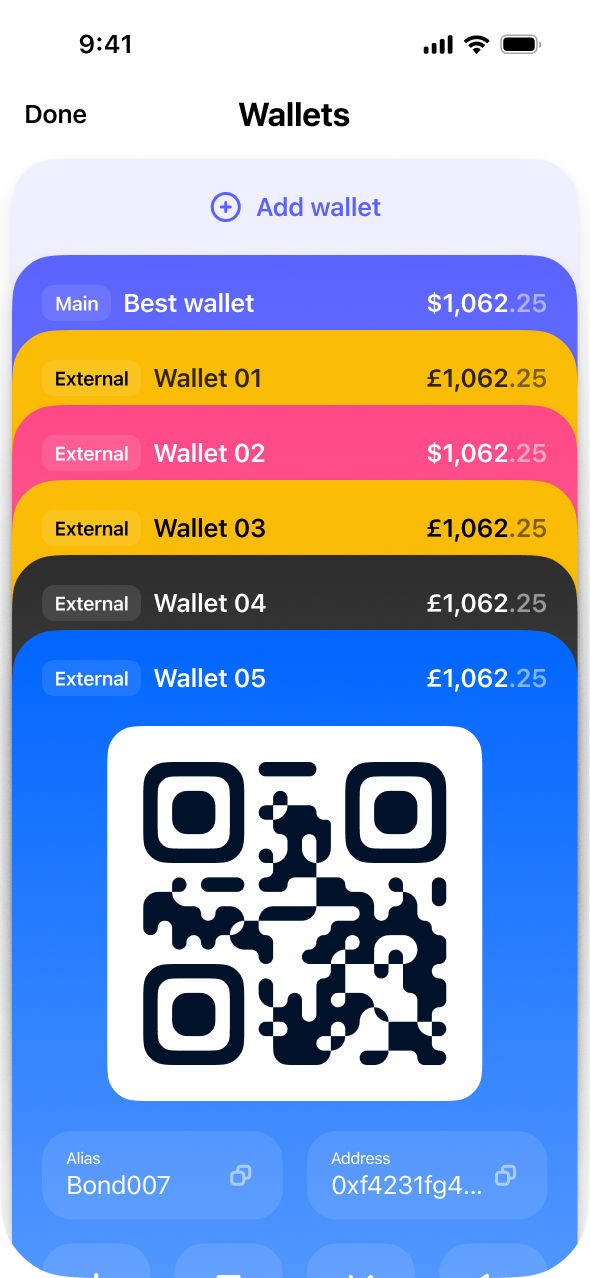
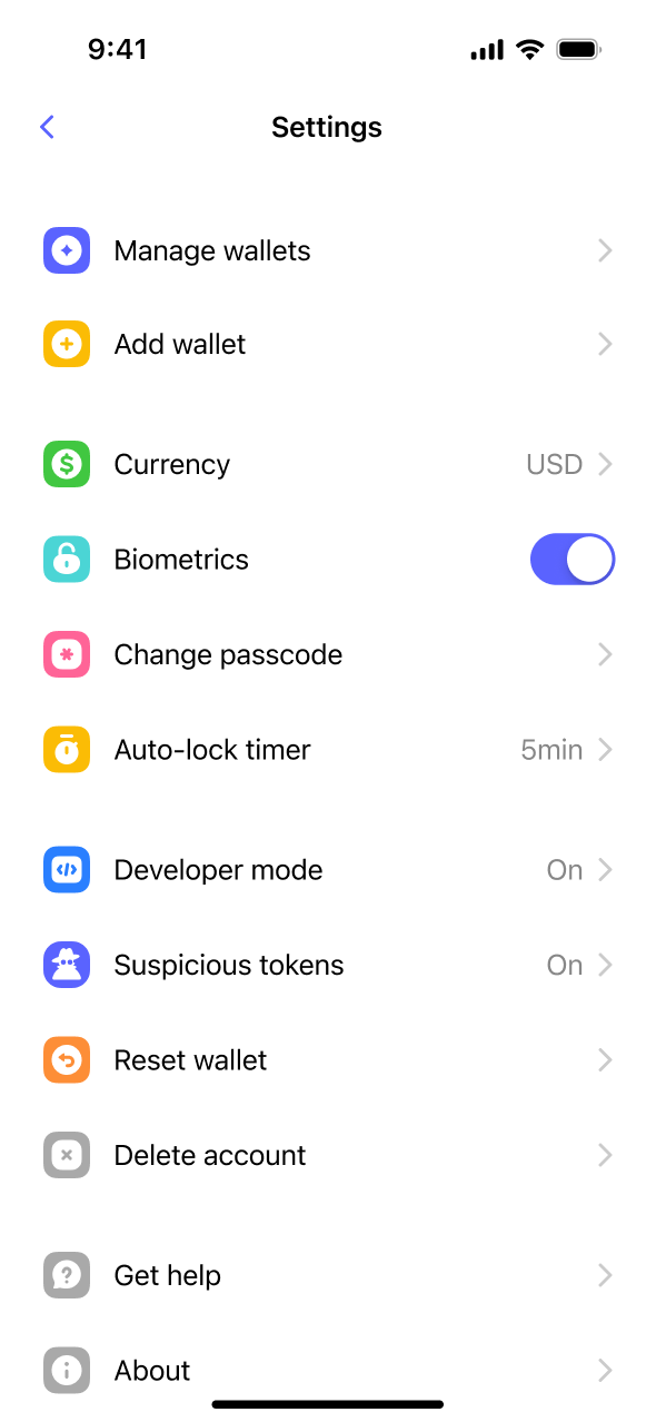
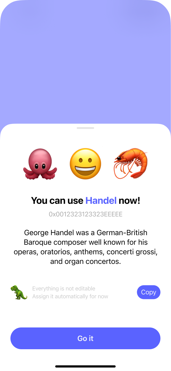
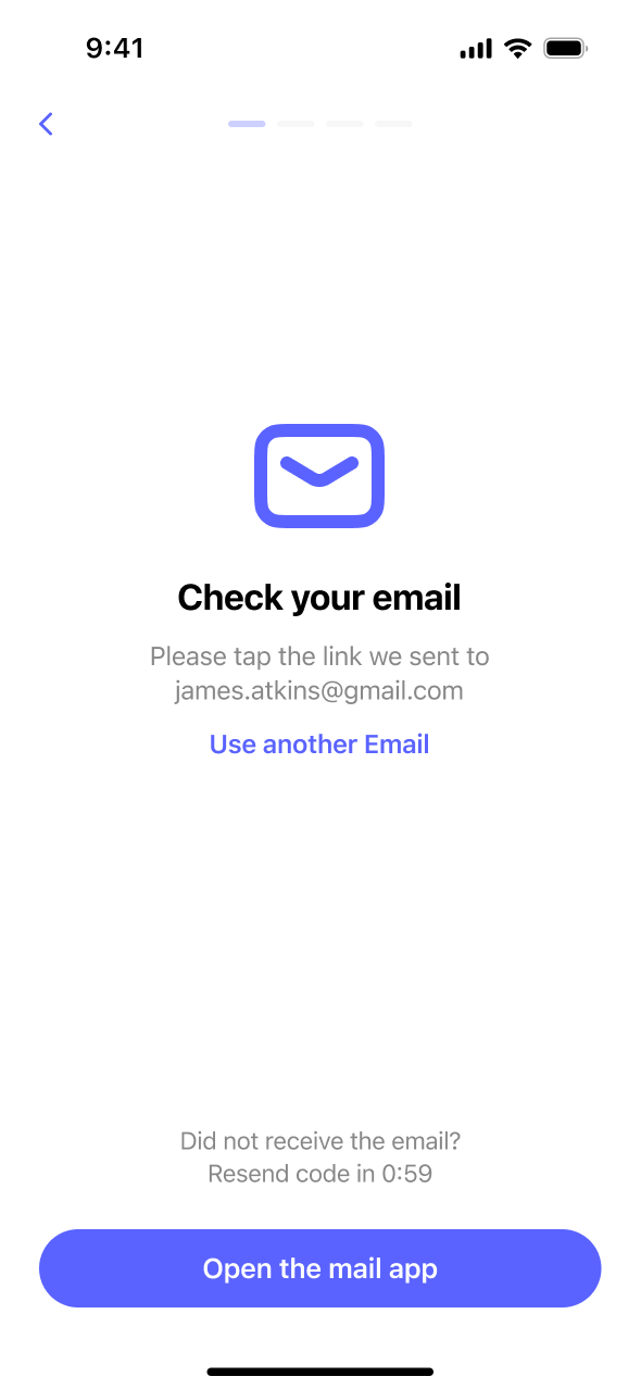
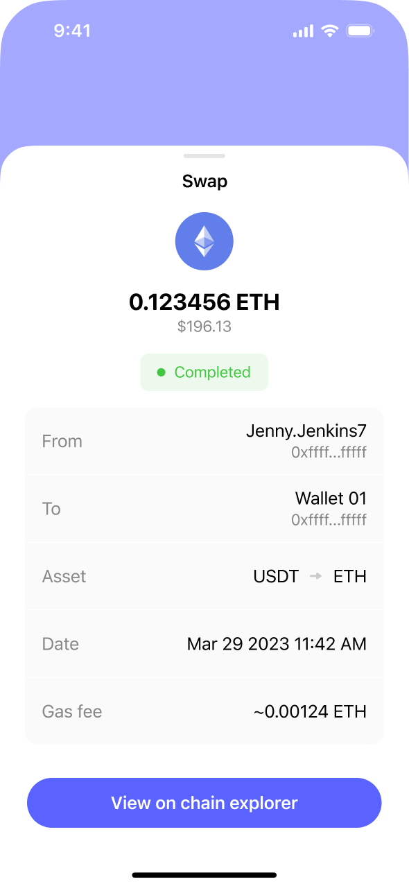
For newcomers, self-custody can feel irreversible and unforgiving. The interface needed to reduce pressure while preserving the ownership, transparency and control experienced users expect.
Wallet creation, payments, swaps and confirmations should not feel like unrelated steps. Users need to know where they are, what is changing and what they are about to confirm.
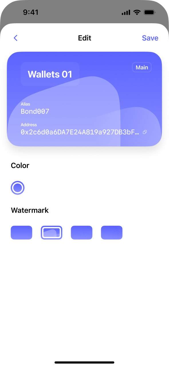
Motion and visual detail appear only when they add confirmation, recognition or understanding. Brand symbols, wallet cards, onboarding and success states work together to make a technical product feel familiar.
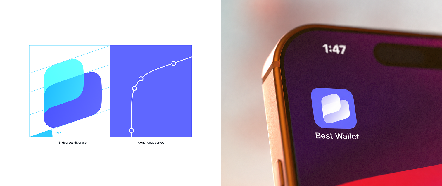
The visual system releases “control” from heavy financial metaphors. Continuous curves, a 19° forward tilt and a blue-purple-to-cyan gradient give the brand technical precision without losing lightness or momentum.
The mark began with the ideas of a wallet, a path and continuous connection. After exploring wordmarks, wallet silhouettes, the letter B and supporting characters, the direction was refined into two continuous surfaces. A 19° forward tilt and consistent curvature create a stable, progressive visual centre, forming an identity that can scale across the product family.
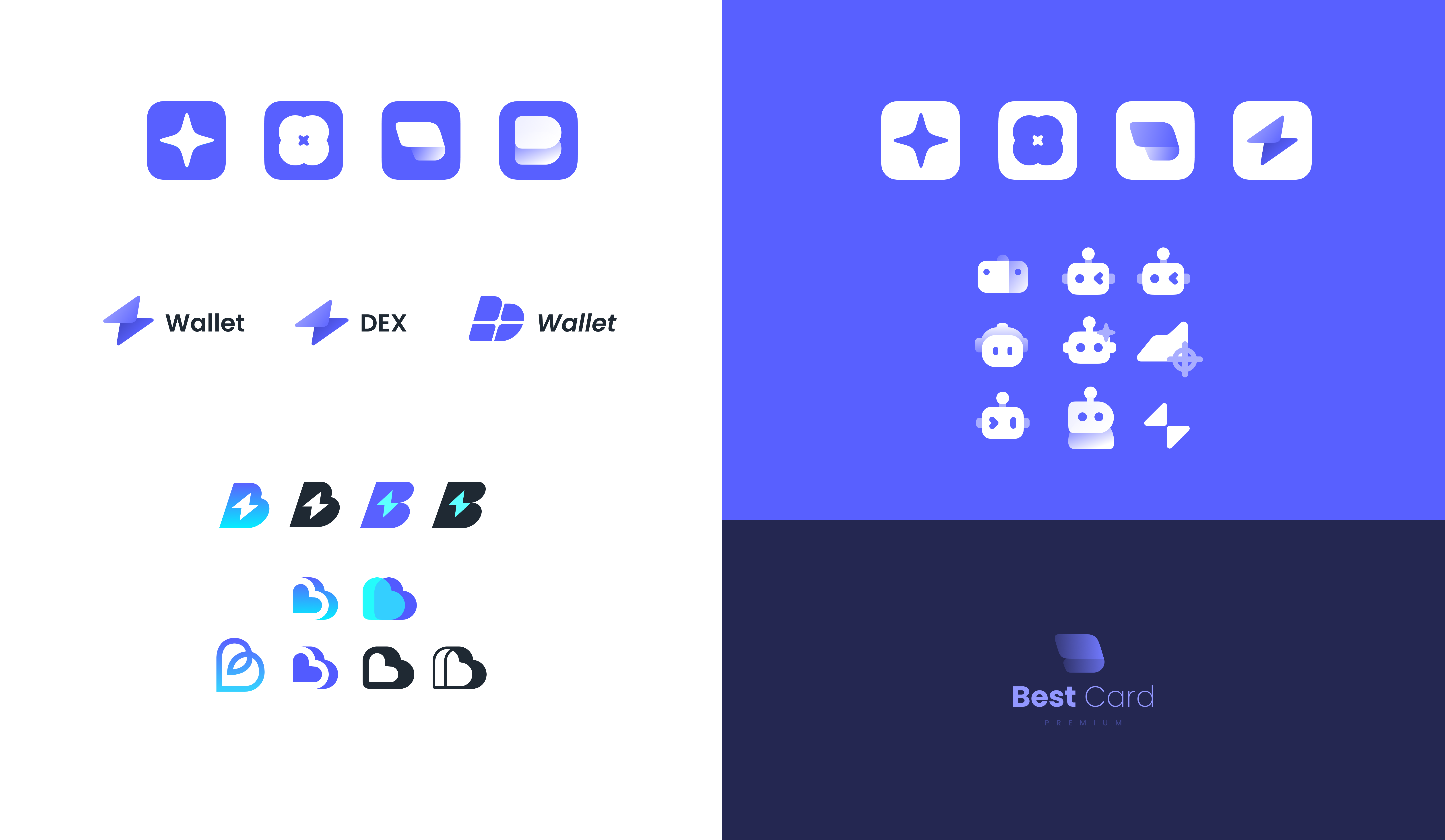
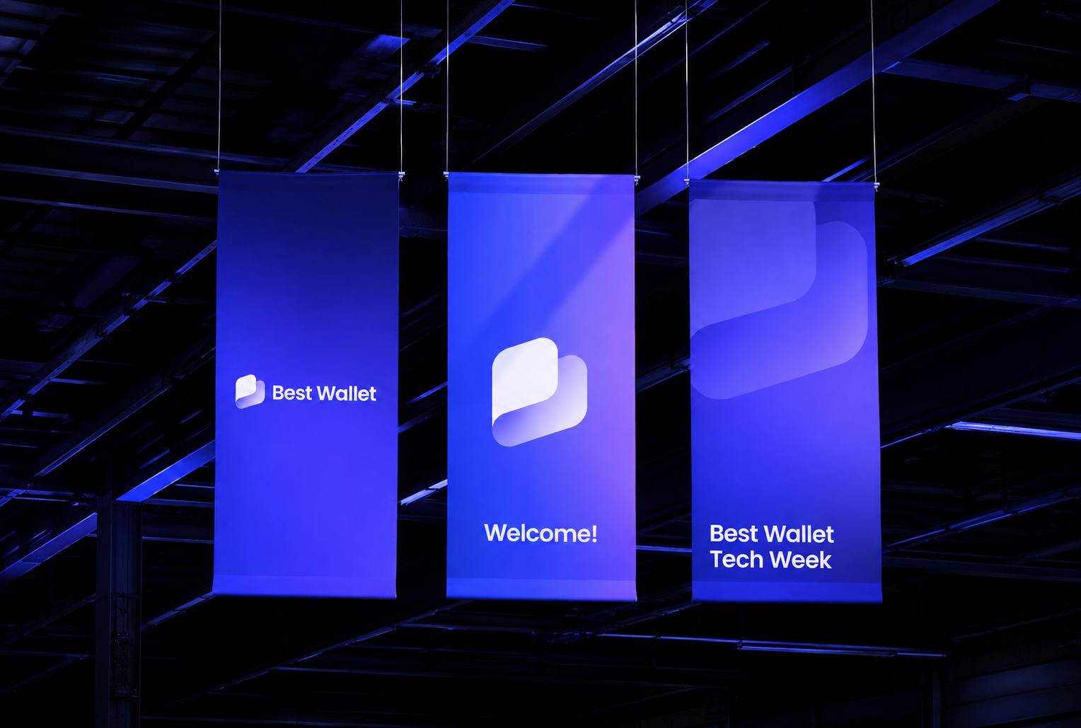
The same formal logic extends to Best DEX and Best Card. Each product is distinct, while icon proportions, gradient direction and wordmark relationships remain consistent.