Product Design / SaaS / Web3
Web3Payments
Turning fragmented presale data into a research-led, validated decision framework for monitoring, diagnosis, and action.
Background
From seeing the numbers to knowing what to do next
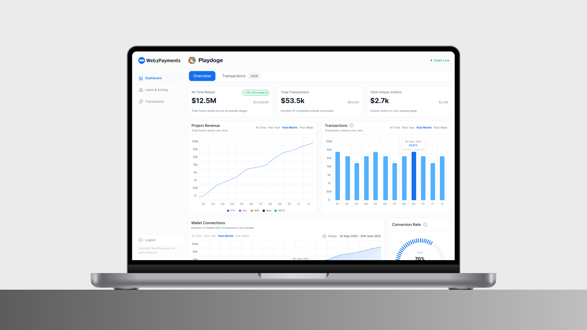
Web3Payments already captured extensive presale data, including visits, wallet connections, transactions, revenue, and country performance. The challenge was not data availability. It was turning fragmented signals across tools, spreadsheets, and admin systems into decisions a team could make during a live sale.
At platform level, Web3Payments has enabled more than $750M in transactions, supports 118+ countries, and accepts 500+ cryptocurrencies. The analytics problem therefore sat inside a large, fast-moving operational environment rather than a hypothetical reporting exercise.
Instead of starting with the metrics the platform could expose, I started with the decisions users repeatedly needed to make: Is the presale on track? What changed? Where is conversion breaking down? Which markets are performing efficiently? And where should the team act next?
My contribution
As Lead Product Designer, I led the research synthesis, translated recurring user decisions into a metric hierarchy, defined the analytics information architecture, and designed the Dashboard Overview and Marketing & Performance experience through to validation and final interface.
Research revealed a shared decision pattern
Founders, marketing teams, and operations teams watched different signals, but research showed that their underlying workflow was similar. They first needed to assess overall health, then investigate an unexpected change, and finally decide whether to scale, fix, or monitor.
Founders focused on fundraising health and round progress. Marketing teams needed to understand which regions and acquisition efforts produced buyers. Operations teams needed to locate transaction anomalies, wallet connection issues, and conversion drops.
This shifted the design brief from “show more analytics” to a clearer product question: how might we support the sequence from signal → diagnosis → action?
01 / Research & Information Architecture
Designing around decisions, not available data
The dashboard panels were selected from user research rather than from a list of available metrics. I synthesised the recurring questions users asked during live presales and mapped each question to the minimum evidence needed to answer it.
I prioritised signals using three criteria: decision frequency, business impact, and actionability. This made the hierarchy intentionally selective: frequently checked signals belong in Overview, while less frequent but more analytical evidence belongs in deeper analysis.
I then split the experience into two levels. Dashboard Overview supports rapid monitoring and anomaly detection; Marketing & Performance supports diagnosis, comparison, and prioritisation.
Research-led design principles
- Prioritise the signals users check most often when judging presale health.
- Keep related metrics together so a change can be explained rather than merely observed.
- Use consistent time ranges and filtering logic to prevent misleading comparisons.
- Move supporting evidence into deeper analysis instead of giving every metric equal prominence.

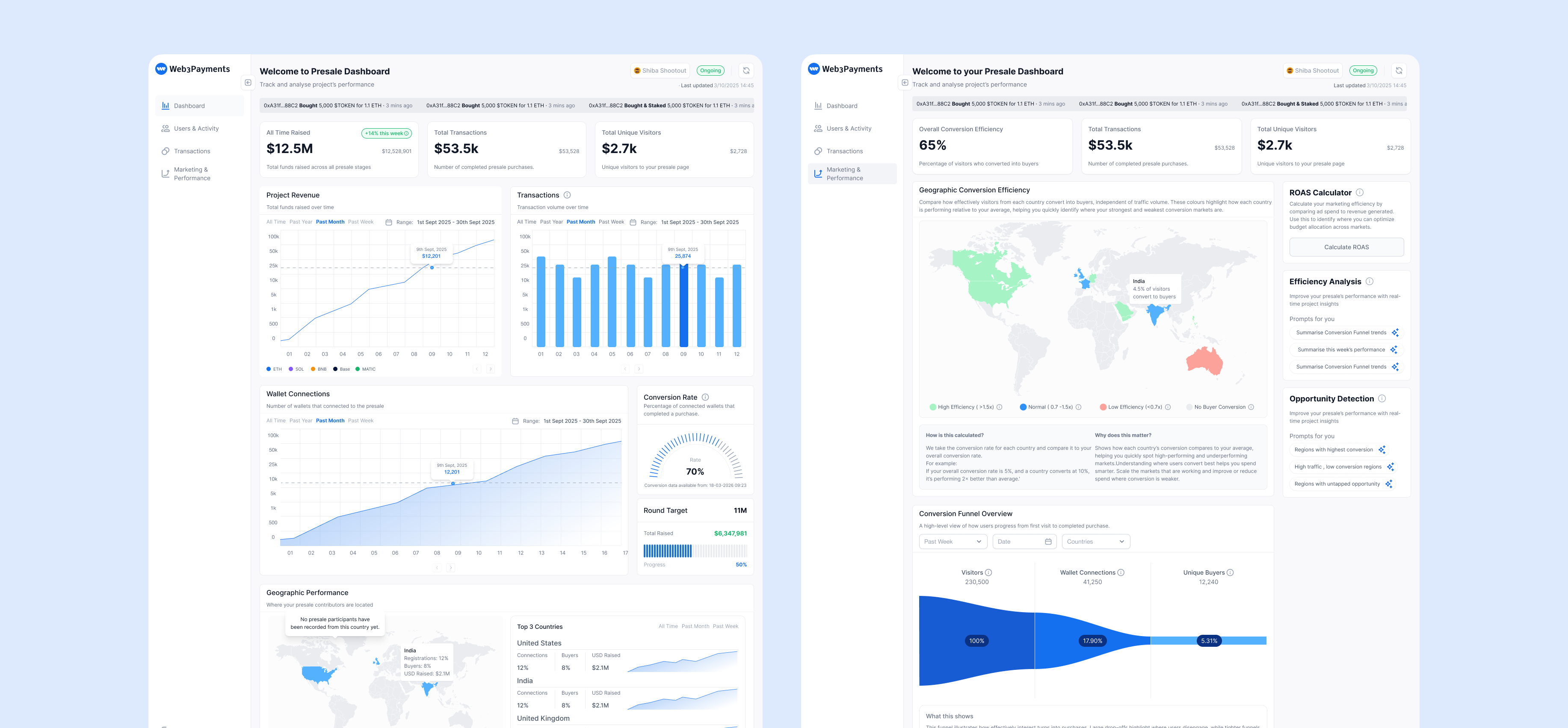
Overview for monitoring, deeper analysis for explanation
Research showed that users did not need equal access to every available metric. They needed a small set of signals that could tell them whether the sale required attention, followed by enough evidence to understand why.
The Overview therefore concentrates fundraising progress, transactions, visitors, wallet activity, conversion, and geographic signals into a fast scan. When something changes, users can move into the corresponding deeper analysis instead of interpreting the entire dataset at once.

02 / Revenue & Transactions
Connecting growth outcomes to their causes
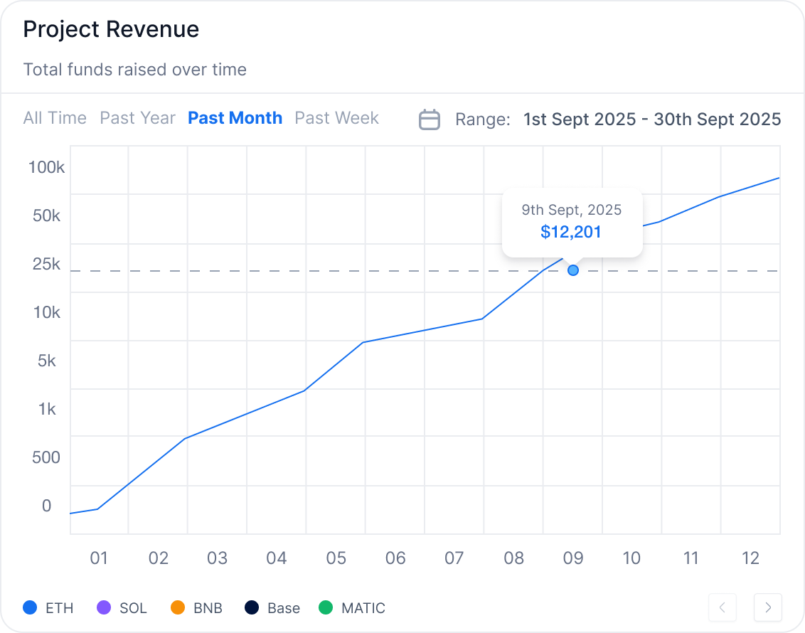
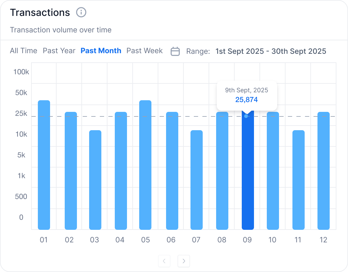
One recurring research question was not simply “How much did we raise?” but “Why did the number move?” Revenue can increase because more users complete a purchase, average transaction value rises, a few large transactions occur, or a specific market or campaign suddenly grows.
That behaviour informed the decision to place Project Revenue and Transactions side by side with consistent time ranges, aggregation, and filters. Users can compare financial value with buying activity and distinguish broader buyer growth from a small number of high-value purchases.
Why two charts instead of one
Revenue represents financial value; transactions represent buying activity. Combining them would save space but blur the meaning of each measure. Separate charts preserve their semantics while shared controls make comparison straightforward.
Revenue = Transactions × Average Transaction Value
03 / Conversion Funnel
Locating the problem, not just reporting conversion
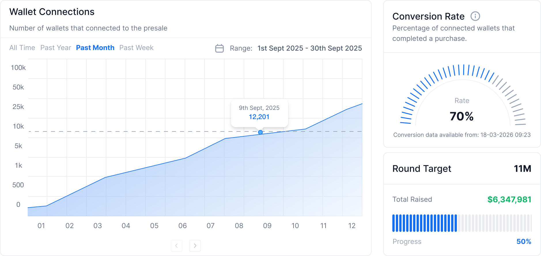
Research repeatedly surfaced the need to distinguish acquisition problems from purchase-flow problems. A wallet connection is a strong intent signal, but it is not the same as a completed purchase.
I therefore modelled the journey as Visitors → Wallet Connections → Unique Buyers. In Overview, Wallet Connections sits beside Conversion Rate; in deeper analysis, the full funnel lets teams identify whether the largest loss happens before connection or after a user has already shown purchase intent.
The diagnostic value of the funnel
If visitor-to-wallet conversion is low, the team can investigate traffic quality, value communication, or the connection experience. If wallet-to-purchase conversion is low, the investigation shifts toward network selection, balances, transaction failures, and purchase-flow clarity.
04 / Market Performance
Compare market quality, not only market size
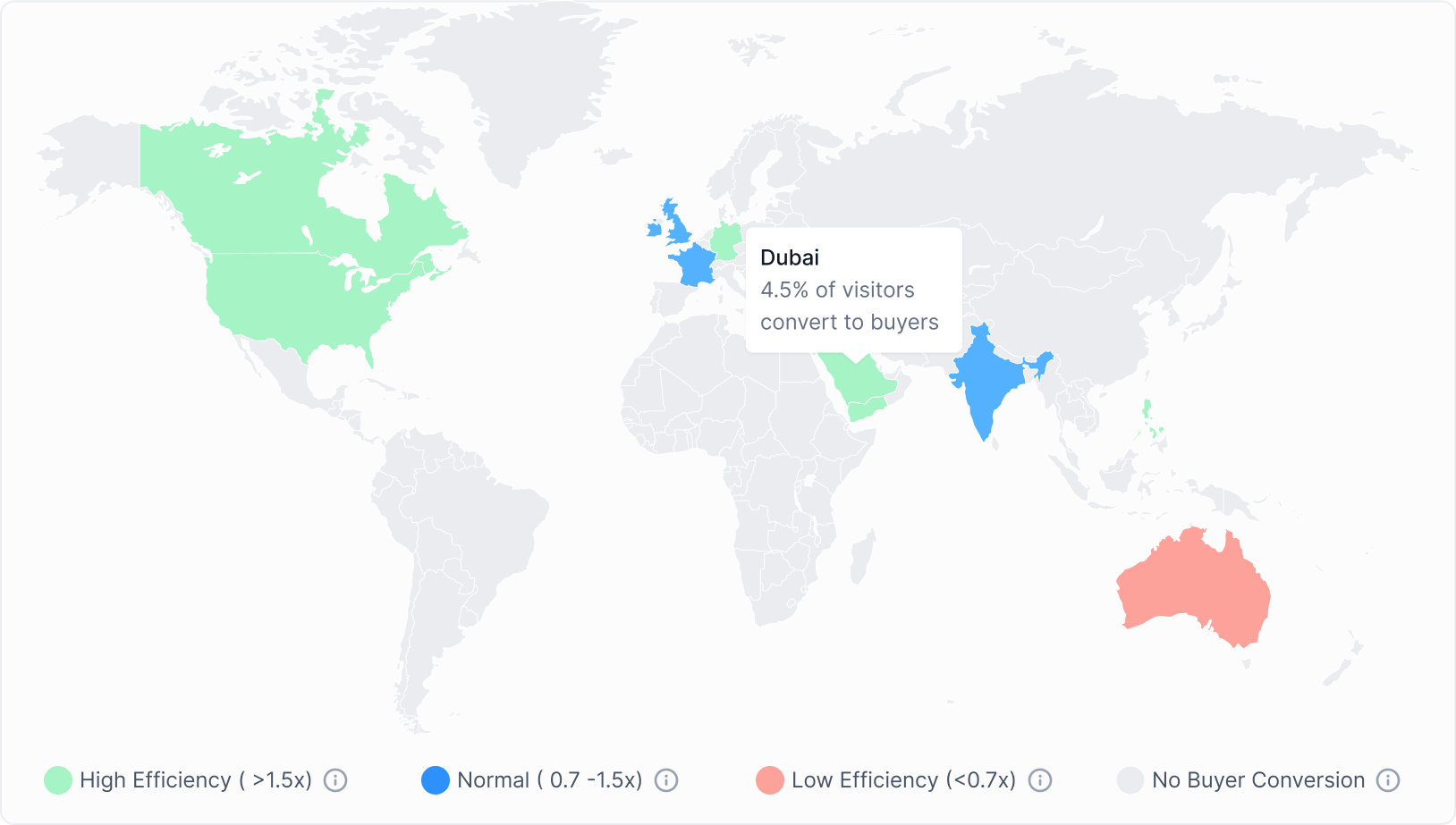
Marketing users naturally watched traffic by country, but research showed that volume alone could distort prioritisation. Large markets dominate absolute charts even when smaller markets convert much more efficiently.
I therefore coloured countries by relative efficiency, comparing each market’s purchase conversion rate with the project average. The map changes the question from “Where are the most people?” to “Where is performance better or worse than expected?”
How it is calculated
A market above 1.5× the project average is marked High Efficiency; 0.7–1.5× is Normal; below 0.7× is Low Efficiency; markets with traffic but no buyers are shown separately. If the overall rate is 5% and a country converts at 10%, that market performs 2× better than average.
05 / Prioritisation Model
Turning analysis into a next action
Research also showed that identifying an interesting market was not enough; teams still had to decide whether it deserved more budget, investigation, optimisation, or simply monitoring.
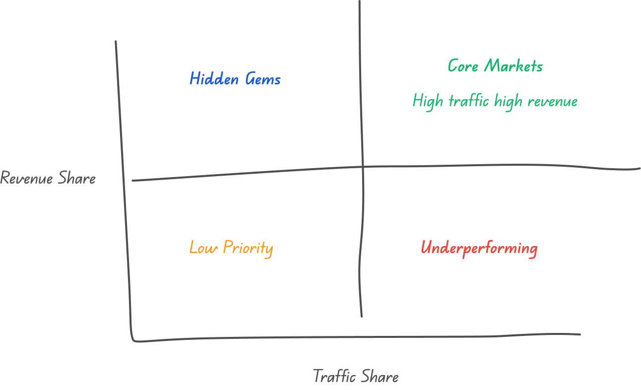
I combined traffic scale and revenue contribution into a two-dimensional prioritisation model. High-traffic, high-revenue core markets should continue to scale; high-traffic, low-revenue markets need conversion improvements; low-traffic, high-revenue markets are opportunities to explore; and markets low on both dimensions should remain under observation.
This is a prioritisation matrix rather than a predictive score. Its purpose is to turn analytical signals into a shared language for action.
Four market types and corresponding actions
- Core Markets: high traffic and high revenue; continue scaling while maintaining conversion quality.
- Hidden Gems: lower traffic but strong revenue efficiency; test further and expand acquisition.
- Underperforming: high traffic but weak revenue efficiency; prioritise the landing page and purchase funnel.
- Low Priority: low traffic and low revenue contribution; monitor rather than prioritise investment.
06 / Key Design Trade-offs
What I deliberately left out
The research gave me permission to be selective. The goal was not maximum information density; it was to preserve the information users needed at each decision point.
- Every metric in Overview: completeness was less valuable than a clear monitoring sequence.
- A single combined revenue chart: separate charts take more space, but make causal comparison easier.
- Absolute traffic on the market map: relative efficiency is less immediately familiar, but better supports budget and market decisions.
07 / Validation
Validating the decision model, not just the interface
I validated the dashboard with target users through realistic presale scenarios rather than asking for general visual feedback. Users were asked to assess overall campaign health, explain changes in performance, identify where conversion was breaking down, and decide which markets required attention.
The feedback was consistently positive. Users understood the separation between Overview and deeper analysis, could follow the intended path from signal → diagnosis → action, and recognised the hierarchy as matching the way they monitored live presales in practice.
The validation also helped refine metric hierarchy, terminology, and the relationships between revenue, transactions, wallet activity, conversion, and market performance before the final design.
Outcome & Reflection
From fragmented data to a shared decision framework
The final system transformed a large set of presale data into a smaller, research-led decision model. Dashboard Overview supports rapid monitoring; Marketing & Performance provides the evidence needed to explain anomalies, understand conversion, compare market efficiency, and prioritise action.
User validation confirmed that the hierarchy matched how teams actually worked: scan overall performance first, investigate when something changes, and move into deeper analysis only when a decision requires it.
More importantly, the project created a shared analytical language across founders, marketing, and operations by connecting fundraising, transactions, wallet behaviour, conversion, and market performance within the same framework.
What I learned
The hardest part was not drawing the charts; it was defining the relationships between them. The work shifted from displaying more metrics to deciding which signals belong together, what should be seen first, how an anomaly connects to evidence, and how that evidence becomes a next action.
The outcome was not simply a clearer dashboard, but a validated decision framework for running a live presale.